Sunday, March 27, 2011

kennedy, Blog Post #10, Iarc 221

Revolution Through Silver


 For me Silver carries a message of revolution.  During the Revolutionary war in the U.S.A. the way that one ate with their silver told others who they stood with, which side there were on.  Those eating in the continental style were the enemy.  The "proper" form in which Americans eat today is not continental style, it's an adapted style.  A style that was developed to be different and to show others that they were different.  Silver also represents Revolution in the way that it is produced.  Once reserved for royalty only, new technology in the industrial revolution allows for mass production of silver pieces.  This allowed the newly emerging middle classes to live like the king.


Silver also represents stratification in the classes.  Only those with the resources could afford silver, which separated the classes.  Some patterns like the one pictured take it a step further.  The first picture shows the basic pattern.  The second picture shows the three basic pieces, fork, knife, and spoon.  Here we see that they are engraved.  So we have taken a newly "mass" produced item and added a layer of hand tooling or customization to the object.  This adds a layer of stratification to the haves.


Above is a close of up the fork handle.  You can see the hand engraving as well as the monogram.  so we have, not only custom pattern engraving, but also, initial of the owners.  A second layer of stratification for the haves.


One of the greatest aspects of separation is seen in the above pieces.  From left to right, oyster fork, ice cream fork, and grapefruit spoon.  All of these items were created for one purpose, to eat one individual item.  This item would have been an extreme luxury during the time, especially considering a specific piece of silver was made for its consumption.


The final layer would be in serving pieces.  Coffee services, trays, large serving pieces.  All are large in scale, serve a specific task, are highly ornamented, and highly coveted.  This starts the clock for future revolutions.  The haves end up having more and more and the have nots, less and less.  This creates unrest and ultimately can lead to another revolution.

RR10, Revolution

Monday, March 21, 2011

Kennedy, Blog Post #9, IARC 221

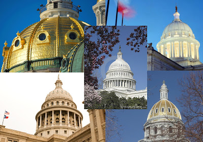
Through the development of buildings the dome has come to symbolize power, wealth, and the heavens.  Originally for the church only, they become more and more prevalent everywhere as time marches forward.  Colonial expansion to the United States proved to be an excellent place for us to adapt the Dome to our own liking.  Look around and we will see our Nations capitol has a dome.  This directly trickles down to many of the state capital buildings as well.  This starts to create a cohesive "look" for our democracy and sets up a Language of government for us.

Modern objects that we have created and spread across the world are numerous.  I'm choosing a group of objects by a singular company, Apple.  Apple was created here in the states, all the design work is here in the states.  Multitudes of jobs are created by Apple across the entire world.  The new colonial expansion has put intuitive, well designed products that work in the hands of millions.  People crave new items from them.  It's almost like a religion.  Individuals work long hard hours, save up their money and give it all to the new Religion.....  maybe that is a bit far, or not.  Their products and the use of their products has created their very own lexicon for what technology is and should be.  Click on the image below to see the progression of design ideas that has come from Apple and has been spread across the world.


http-_edibleapple.com_wp-content_uploads_2009_04_apple_evolution

http-_www.manhattanconstructiongroup.com_wp-content_gallery_20090204020256_1907-oklahoma_capital_dome_exterior_at_night_3

http-_www.bruceq.com_galleries_photo_20_658


http-_farm4.static.flickr.com_3585_3287360783_94ce75da41

http-_thumbs.dreamstime.com_thumblarge_38_1137785692K7A3Nn

RR9, Tempietto

Saturday, March 19, 2011

A Pattern Language (theory 4)

A pattern Language was an incredibly interesting reading.  Ideas the make for a pleasant space are identified and reasoning for them explained.  For the St Mary’s house writers retreat I feel there are two major issues to deal with.  First is how to deal with public/vs private space and secondly, how to get an abundance of natural light into the rooms.  With these ideas in mind I plan to utilize the following ideas from the reading:

Intimacy Gradient - Short Passages - Indoor Sunlight

Intimacy gradient is the greatest challenge in the space.  How do you create a very public space, combine that with a semi-public space, combine that with a private space, and combine that with an intimate private space, such as a bedroom.  Utilizing an intimacy gradient will create suggested or inferred lineation between these spaces.  Arranging the space sot that the public spaces are on the outer fringe and the closer you get to the inside the more private the space becomes.  In the space that I am designing there will be a public office at the front and a public reading room at the rear.  The public reading room can be completely closed off from the private space with a door.  I feel this is necessary to protect the private from the most public area.  The office will have space for a conference table and a writing desk and will link to the living space of the house through a bookcase lined corridor.  The bedroom, one of the most intimate spaces is only accessible through the living room and the private bathroom accessible through he private bedroom.  This arrangement creates this privacy gradient and separates the most intimate spaces.

The idea of short passages is a way for me to create an intimate welcoming space.  Along the west wall, the wall with the fireplace, the passage is created.  The awkward placement of the windows aligns them between rooms that have been created.  This is somewhat deliberate in a way to share light between all the rooms.  I propose to build built in book cases along the majority of the west wall and to incorporate large window seats under the two windows.  These would act as a reflection space.  One between the office and living room and one between the living room and kitchen.  This instillation allows for the creation of short passages that are full of interest and are functional.  They are not just a hall that is wasted space, they provide storage and extra seating as well.

Indoor sunlight is a huge issue in the space.  The front of the structure faces south and has an attached porch which limits the light that can enter.  The east side has three large windows that open to a wooded area.  The same is true for the north side of the structure, all windows face a wooded area.  The only good source for light is on the west wall, where there are only three windows, which are awkwardly placed.  To solve this issue I plan to keep most of the west wall open, or without division or closed off rooms.  This will allow the office, living, dining, and kitchen to all share the light from this side of the house.  I also am proposing the addition of three skylights in the roof on the east side.  Here they can introduce an abundance of filtered light and not be visible from the street to satisfy historic code requirements. 

These three ideas will create a welcoming and functional space while preserving the historic nature of the building.  Intimate spaces, large gathering spaces, comfortable living quarters unite here to provide the perfect writers retreat for any writer.

Tuesday, March 15, 2011

Dining together day


The dining together day project incorporates a 2015 United Nations Resolution to utilize social media and guests from all over the world to dine together in an effort to eradicate world hunger.  The event takes place bi-annually on the summer and winter solstice.  We were to design a space, a dining table, and a sideboard to incorporate 4-10 people.  In my parti I explored the ideas of circles, lemons, greens, yellows, and other naturally occurring ideas for my inspiration.  Here is the final project, it's parts, and my process.

My presentation board presents one cohesive statement that is well organized, integrated, and complete.


Room perspective - Walls of glass act as television screens to incorporate the guests into another cultures dining experience.  This is accomplished by projecting the alternate location around them, immersing the participants in another cultures experience.  Floors are terrazzo, the fireplace is stacked slate, all wood elements are walnut.  The yellow green color on the walls reminds me of the rind of lemons and limes, which my parti was based upon.  After coloring the ceiling an ivory color I feel that a pale almost sky like blue would be more appropriate as this would visually tie the ceiling and outdoor sky together, helping the room relate more to the outdoors around it.

I chose the Kanu Chair.  Designed by Konstantin Grcic and produced by Cassina.  This chair is made of wood and is somewhat snug, yet still comfortable.  I chose an all wood chair to remind the participants that they are there to eradicate world hunger.  Over a long dinner I would anticipate the wood would be slightly uncomfortable, reminding the diners that hunger is not a pleasant experience. 

Floor Plan - Dotted lines show the beams in the ceiling that frame the actions on the floor itself.  The table sits off center in a space defined by the ceiling.  The fireplace sits directly opposite the table.  The guests at my dinner will be cooking their food in the expansive fireplace.  The three sideboard pieces sit adjacent to the fireplace.  Individuals enter the space through a large opening in the north corner of the room, giving them an unobstructed southern view over the mountains below.
Axonometric View - Shows how the fireplace has a raised hearth which is instrumental in the preparation of the dinner.

South West Elevation - shows the outdoor terrace that steps gradually into the landscape.

Dining table plan - My original plan was to have a much more arched leg opening.  This ended up making the table look like the Colosseum in Rome.  I re-evaluated and made the legs much more narrow and the arches barely evident to create a more elegant, simple table.  I chose an oval shape to somewhat contrast the hard, sharp edges prevalent in the room.  The table is made of walnut.
Sideboard - Inspiration for my sideboard came from both a lemon slice and a grouping of chrome hardware knobs grouped together.  Three of these units will be placed together to create the sideboard unit.  Two door on the front of each sideboard open to revel storage. 
Model entrance view - This is the view one sees entering the room.  The fireplace is to the left.  Evidence of the beamed ceiling is above and frames the dining and preparation areas below it.
Model view from the west wall.  The table is seen first and the fireplace is behind it which is represented by the wall bump out.
Model top view - shows the model and how it is the same as the plan view.
This is the beamed ceiling that I created.  When used on the model I felt it was not as refined as it needed to be so I chose a flat beam detail to represent them in my final model.
My perspective work sheet where I worked out some techniques and color choices for my final perspective.
Un-resolved room perspective.  This is the perspective of the initial room that I designed.  The scale did not seem quite rite and Stoel and I discussed how to improve upon this idea and make it work better.  I feel that my final design was much more successful than my initial design.
initial axon drawing.  The columns seemed way to large in this space as did the area between the table and fireplace.
Initial plan - shows the same table and sideboard that I used in my final drawing.  I did scale the sideboard down from 5 pieces to 3 pieces.
My initial sketch model, showing the fireplace and the table that resemble the Colosseum.


Monday, March 14, 2011

RR8, BELVEDERE

Kennedy, Blog Post #8, IARC 221

Throughout history people have constructed spaces around creating ideals and establishing order.  Just as in a nautilus shell, these structures evolve and change during different time periods, always creating what is considered modern and appropriate at the time.  A creation of order and following is created with each new addition, building upon the past.