Tuesday, December 7, 2010

Reflections on a semsmer of drawings

I believe this is one of my final blog posts for the semester for Design Visualization.  This has been such a challenging and rewarding course for me.  Most of the terminology was new to me.  Most of the instruments, pencils, triangles, drafting boards were items that I knew of and wanted to use.  I think the most important thing that I learned in drafting is patience.  Taking my time, being neat, and clean made my life so much easier;  and my drawings much cleaner when finished.  I also learned that sometimes it's easier to just start over.  I did this a lot.

Paper Rips.
                   Pencils Slip.

                                       Rulers Shift.

                                           [Straight edges aren't always straight]

                               Velum hates being erased

On the non technical drawing side in the world of sketching and shadowing, I gained a lot of experience.  My greatest success story was learning how to create images through shadow rather than line.  I'm still not very good at it and need lots and lots of practice, but I now know that shadows create everything.  I still struggle with people and proportions.  I can draw myself as Vasco De Gamma or some other 15th century figure, proportionally slightly askew and final image somewhat awkward.  I learned that trying and trying and trying are the best ways to  understand what I'm trying to portray.  It's frustrating at times and hugely rewarding even more. 

This is my most successful technical drawing of the semester.  I chose this drawing because it was the most challenging.  I was given an orthographic view with 4 measurements and I had to figure everything else out.  I learned a great deal about how scale drawings work by doing this exercise.  I also learned that from some parts I can assemble additional information to create a whole.

Monday, December 6, 2010

L U M I N A I R E

Luminaire - The final phenomenon.  In this project I created a light effect that emulated the varying layers and depths of shadows seen in pea gravel.  This is my process and my final project.


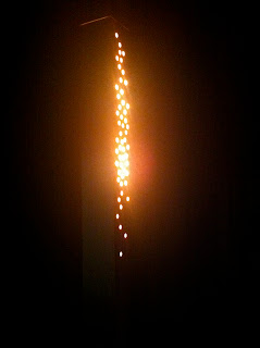
The Light effect I was trying to create.  Soft layers of shadows that when overlapping create more depth.  The closer to the surface the brighter the shadow.  The deeper down the softer and darker the shadow.

My luminaire and the light effect that it creates.

This is a view of the luminaire light filter.  I arranged the holes in a manner that suggests a path like journey.  I derived this from my parti which was title Vestige; a faint mark or visible sign left by something which is lost, a trace, a sign, a track, or a footstep.

Another view of the light filter and the aperture around the top of the piece.  The top of the luminaire hovers about 1/4 of an inch above the surrounding sides.  This allows a slight glimmer of light to emerge and define the luminaire itself.  I felt it was important to show where the light was coming from, yet more important for it not to detract from the light effect.
This is a close up of the aperture at the top of the luminaire.  This detail also allows for ventilation within the Luminaire, allowing a place for heat created by the light bulbs to escape.

View of the desired light effect and the aperture.
The final luminaire.  The piece is four inches square and forty-eight inches tall.  I chose these dimensions to make the piece more human in scale.  When placed in a room the piece will blend in yet if one comes upon the piece it makes itself known since it is at eye level.

This is the reverse side of the above image.  Here you can see the elegant simplicity of the piece.

The Luminaire was created in two pieces.  This decision was made primarily so that the bulbs can be changed within.  If this were a production piece a great deal of flexibility would be available in the overall height of the piece by varying the height of the base piece.  The top piece features a concave 45 degree cut while the lower piece features a convex 45 degree cut.  This allows the top piece to sit on top of the bottom piece and create a secure tight joint that does not allow any light to leak.
Detail view of the aperture opening.  This opening is magnetically adjustable, and can be completely closed as well.

Top Piece

Top Piece and Bottom Piece side by side.  Each are 24 inches tall.
Inside View.  here you can see the plates that the magnets attach to as well as the placement of the light bulbs inside.  I chose to offset the light bulbs to create more dramatic shadows.  You can also see the layers in the furniture grade plywood which related to the layers of shadows as well.  The luminaire was constructed of furniture grade plywood, each side is back cut at a 45 degree angle.  This creates a seamless cube.
Inside view of the back of the holes.  I used a forstner bit to create a hole that is 3/4" in diameter and penetrates to 1/4 of an inch from the front of the piece.  I also used a countersink bit in the last 1/4 inch.  This created a cone from behind which allowed for a double shadow effect to be created. 
Composite Drawing, showing the created light effect and scale drawings.

Detail view of the scale drawings.

Section drawing detail.

Luminare - Development Process - part 3

In this post I am exploring the development of my final light phenomenon.  I gained an incredible amount of knowledge on how light reacts in different environments and with different materials.  I also experimented with different light bulbs.  I tried a halogen flood light which was too hot and created it's own light effect.  I tried a cfl bulb which created a total wash pattern, a clear incandescent bulb which created the proper light effect, just not enough of it.  Finally; I tried micro led lights that completely filled each hole that I had created in the light filter.  They looked great if you were looking at the filter, yet projected a perfectly even field of light when projecting on a surface.


Light Filter development piece from my last prototype development piece.  This prototype ended up being the basis of my final piece.

Interior view of my final prototype piece.  Here you can see how rough the holes are drilled and two different sizes of holes.  Creating this piece showed me that I only needed one size of hole and the holes needed to be larger rather than smaller.  The holes also needed to allow more light to the surface of the light filter.  In essence create a thinner piece of wood.The small holes ended up being pointless and did not add anything to the light effect.

Small hole light filter, did not create any type of light effect for me.


Here is another view of this prototype.  Here you can see the scale of the piece, the green mat is 24 inches long.  I used two different sizes of hole and created a meandering pattern along most of the piece.  I had slits cut at the bottom to emulate how light travels and to show the source of light.  Through the development of this piece I learned that the slits at the bottom did not contribute anything to the piece.  There were way too many holes which created a light wash rather than a distinct light effect that I wanted.

Stoel and I looked at the pill box and decided that it was not really relative to the light effect and considered changing the scale of the piece.  I created the piece out of plastic.  This piece is 4ft tall and 4 inches square.  I really got excited about the scale of this piece.  It seemed that if I made it about 5 ft tall it would be more human in scale.  I was interested in this scale as a luminare since it seemed a little out of the ordinary.  I also enjoyed the way that the piece started to create the light effect that I was after and it was all about the light.

This is a side viewof the prototype that Mira and  I deemed the pill box.

Top view of the pill box.  I created this piece out of Birch Plywood.  I glued about 12 pieces together to create a thick wood block that I could shape into the curved ends using a huge sanding belt.  I created the curved ends to relate to the Light effect and ultimately abandoned this idea because it was becoming more about the light piece rather than the light effect.

These are the two Light filters.  Small holes in one and large holes in the second one.  Here I discovered the material thickness of the wood became more important that the size of the holes or the spacing of the holes.


  This view shows where I painted one of my light filters silver to create a more intense light originating from inside the box.  this really had no effect on the light that I was trying to create.


Here is another view of my light box with the top cover down.

This is the inside view of my light box.  I created this piece out of plastic because it was an easy material to work with and I could work quickly with it as well.  Here you see two layers of light filters.  I thought this was creating the light effect that I wanted, however, I found out that the pattern was being created by light bulb rather than the filters.

Third Year Critiques - Fall Semester 2010


This morning we were assigned a class critique to attend.  I started with the Tina's third year studio.  They were presenting two different projects.  The first one was a redesign of a Central Regional Hospital, a psychiatric  hospital in Butner NC.  The second one was a historic building in downtown Durham NC, 106 West Parrish Street.  This building would be turned into a wine bar by night, wine shop by day, and contain residential units above.

Tina started by explaining the two projects and then let the designers take over.  Everyone presented their projects and spoke a little bit about their inspiration and process.  I wish they had gone into more detail about their selections and reasoning behind design choices they made.  I know that they must have had oodles and oodles of reasoning behind everything.  After the presentations were over  I asked Tina if they had any specific constraints or requirements to work within.  She explained that the basic shells had to stay the same.  The main areas in which they were working were a Boys wing, Girls wing, adolescent wing, family room,  and Activity room.

The greatest challenge that I saw was adapting the space to a child or adolescent scale.  Making it more comfortable and familiar to the patients.  The space needs to function as a home away from home that envelops and helps them change and grow, rather than be stark and scary.   Some of the plans were more successful at completely changing the way the space felt, while others focused on making a much more calming environment. 

Stoel and Tina explaining the general concepts for us.

This is the design that Hailey Allen composed.  Her inspiration was a calming sea shell.  As soon as she said that all the colors made sense.  Instantly reminding me of the edge of an abalone shell with iridescent green, purple, blue and the tan inside.  Her use of color creates a soothing environment for inspiring rejuvenation and growth and a sense of community.

This is Carlos Smith's design.  The most compelling aspect of his design was working with the adolescent or child as the client.  Everything seems to be more in scale with their scale.  Lowered ceilings in areas bring the scale of the spaces down to the level of the patients.  The use of color is a more familiar color palate for the patients as well. 

This is my favorite view of Carlos' plan.  This is a perspective of a boys room.  I really enjoy how the ceiling undulates down over the bed and shelving is around the bed.  It's almost like he created a fort, or cocoon, for the child.  The compressed area is in a scale more in scale with the child.  I feel that the child would respond greatly to this type of environment.  One which is enveloping and stimulating.  It's like a big hug, and what boy wouldn't want a fort for a bed.


The second project that was presented was for a wine bar/shop/residential building in downtown Durham NC.  Here the designers had to work within the historic parameters set up by the city and a very dilapidated building that had been a crack house.  The clients had asked for a comfortable space that was not intimidating to anyone.  A place that was warm and homelike where everyone in the neighborhood would want to gather.  They want to name the wine bar/shop The Horn.

Brittany Stiles and Haley Preston presenting their concept, BAZAR.  They focused on creating intimate environments and smaller spaces, kind of like a bazar or flea market.  I feel that they utilized the entire shop/bar area very efficiently.  The entire bar can be used as the store rather than just a small section.  In essence the two functions are integrated well and allow each to use all of the available space.

Gaskins and Gonzalez presented the Peacock, a Buddhist inspired space.  Their design is based on the peacock and it's ability to overcome the insurmountable and be beautiful, a transformation that the building will also undergo.  I thought their concepts and palates were soothing, creating a place where I would want to go to be with my friends.  The space was down to earth and was not showy or pretentious and addressed what the clients were looking for.


O'boyle and Wright presented a Cornucopia, based on the cornucopia being a horn.  A nice abstraction I thought.  I enjoyed their use of wood and the ways it was used as a design feature in contrast to some of the more modern elements of the design.


Smith-Dean-Loloci presented The Horn.  Their concept Integrated the Wine bar and the residential spaces in a very unique and fun way using a central light shaft.

Here you can see a section view of the building and the light shaft that penetrates the horizontal planes in the building.  Natural light is one of the most important aspects of a building to me.  This fact that there are two building on each side of this building left only narrow front and rear walls for windows.  The light shaft brings light to all levels and creates an atrium through the building.  I really enjoy the interior balconies and windows that merge the residential with the bar below.  The careful attention to soundproofing along the walls of the shaft is integral to this design aspect as well.

Here is the logo that the design team came up with for The Horn.  I think it is fun and playful and related well to presented design.

This was a rather long post this time.  I know that the students spent a great deal of time on thier projects and thought they deserved some extra space.

Friday, December 3, 2010

Group Drawing

Here is a sketch that I did of Andrada.  The use of shading is somewhat successful here.  More time spent on details would make the drawing more realistic.  Proportions are off, this is an area that I struggle with.

This is a sketch that I did of Josh.  Shading is good in parts here.  Proportions are off, especially in the forearms and facial features.